Skip to content

Accessible Emails

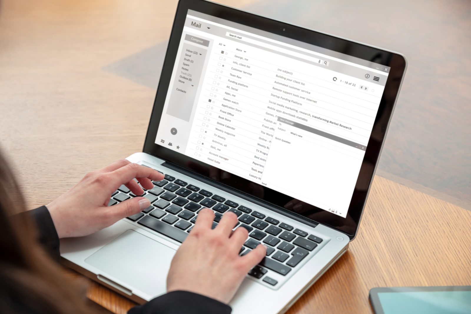
Email client list, woman working with a computer laptop, inbox e mail messages on the screen, business office desk background

Creating accessible emails ensures that all students, employees, and community members, including those using screen readers, mobile devices or assistive technology, can access important information.

Why Accessible Emails?

  • Support students and staff with disabilities.
  • Improve readability on mobile devices.
  • Reduce confusion and follow-up questions.
  • Help the institution meet accessibility and compliance standards.

Accessibility benefits everyone, and starts with clear, readable communication.

Use of Graphics

Graphics can enhance an email by adding visual interest, reinforcing key messages, or supporting branding, but they should never replace clear, written communication. Emails must prioritize informing recipients over visual style, ensuring that all essential information is accessible as text. When used thoughtfully and sparingly, graphics can complement content, not compete with it, helping messages remain both engaging and readable for everyone.

Avoid Large Graphics with Text

Do not use images as the primary way to share written information in an email.

  • Emails should never rely on a graphic (flyer-style image) to communicate key details.
  • Screen readers cannot reliably read text embedded in images.
  • Images may not display properly on mobile devices or with images disabled.

If information must be shared (dates, deadlines, instructions, event details), include it as real text in the email body, not only in an image.

Restrict Image Use to Decorative or Supplemental Purposes

  • Images should be used judiciously as decorative or supplemental content. Not to contain essential information.
  • All essential information must appear as text in the email.
  • Include brief, meaningful alt text that describes the image’s purpose and what it looks like.
  • Images without content can be marked as decorative and alt text can be omitted.

Copy Guidelines

Use Clear, Structured Text

  • Use short paragraphs and bullet points.
  • Avoid dense blocks of text.
  • Use headings or bold text to organize content.
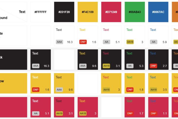
  • Do not rely on color alone to convey meaning.
  • Avoid “Click here” or “Read more.”
  • Links should describe their destination.

Use Accessible Formatting

  • Use a sans-serif font. Avoid decorative or script fonts.
  • Keep font size at least 12-14 pt.
  • Left-align text; avoid full justification.
  • Avoid excessive capitalization (ALL CAPS).

Attachments

Attachments to emails are also required to be accessible if they are intended to communicate information.

If possible, summarize key information directly in the email in addition to the attachment.

Recommended Check Points

Before sending an email out to a large audience, consider testing the email to yourself or a smaller group.

  • Review the email on a mobile device.
  • Send the email to an Outlook AND a Gmail account if the email will be sent to users outside of Black Hawk College.
  • Turn images off to see if the message still makes sense.
  • Ensure all critical information is readable without graphics.
  • Make sure links go to their intended destination.

More to Explore